Pages

Showing posts with label artwork. Show all posts

Monday, April 18, 2016

Watercolor Sketch of Venice


Am very happy, that for the first time have finished a Watercolor Sketch in one session that I am happy with......things are looking up.

This is a Watercolor of San Giorgio Maggiore in Venice after the photo by "Franklin", on Paint My Photo website.

8" x 5" Watercolor & Micron Pen on Moleskine 90LB Art Watercolor Journal 

Thursday, June 12, 2014

Watercolor-Portrait Of Wancen

Wancen
Watercolor 8.5" x 10"
On 140LB Watercolor Paper

I am working on a project with my friend Wancen, and we painted each others portraits to start the project. This was painted yesterday evening under duress to meet today's deadline.
This was also my first ever portrait in watercolor, have lots to learn.

I made lots of mistakes, but she loved the portrait, so I thought I would post it anyway.

Monday, July 12, 2010

Watercolor Demonstration by Bob Krysak

Vermillion Lakes Autumn-Canadian Rockies
9" x 12" on Stretched Canvas
$200.00

My brother Bob Krysak has been trying out painting watercolors on pre-stretched canvas panels sold at Opus Framing, and he documented the process in a recent post on his blog.
If you would like to purchase the original painting, you can contact him at bkrysak@gmail.com or visit Bob Krysak Watercolors.

I copied the information into a Word document, and then converted it to a PDF document using PDF Creator free software. After that I uploaded it into Scribd a free service, that allows you to embed the document into your blog post on any blogging platform.

So here is the demonstration as shown below.


Vermillion Lakes Watercolor Demonstration by Bob Krysak

Thursday, June 4, 2009

Ukiyo-e-The Art of Japanese Woodcut Printmaking

Hokusai Irises
1760-1849
Source Wikimedia-Public Domain

Ukiyo-e means "Floating World" and I have been fascinated with this form of artistic expression since about 1969 when I saw a reproduction of a Japanese Print that my art teacher in high school showed me.

During this period a number of Japanese artists started print making using blocks of cherry wood which are turned into engraving plates by removing excess wood with small knives, and utilizing one single woodblock for each color to be printed.

Step 1 is to create a detailed line drawing, carve that out into a block of cherry wood, and then print that line drawing as many as 100-150 times. W.J. Phillips in his book mentioned that he was able to get a maximum of 150 prints before the block would degrade from the process.

The watercolor paper is kept wet with water during the printing process. The wet paper is laid on top of the block, after the colored pigment (watercolor) is painted on the block. The back of the paper is then rubbed with a block of wood wrapped in leaves. Each impression is then stacked in a pile wet, with newspaper in between each layer.

There can be as many as 10 colors in each print, meaning that there have to be 10 blocks, so the printing process is a long and arduous one.

However the Japanese discovered a beautiful way to expand their markets by providing limited editions of watercolor paintings. In essence they are not necessarily exactly the same because each wash that is applied can have it's own subtle difference from print to print.

Here are some Ukiyo-e resources that you may find interesting.

A guide to Ukiyo-e websites
Ukiyo-e Wikipedia
Empty Easel-A Brief History of Japanese Artprints
The Woodblock Prints Of Ando Hiroshige


Thursday, February 19, 2009

Julian Beever-Pavement Picasso


This is another in my series of My Favorite Artists. Julian Beever, a UK artist originally from Melton Mobray Leicestershire, has been creating amazing optical illusions in the form of pavement art for over 20 years.

I find it hard to stop looking at his work. The illusions are magnificent in that they immediately draw the viewer into a wonderful whimsical world. At the same time your mind is captivated by the fact that the 3D illusion is on a flat surface at your feet, and done completely in colored chalk.

As seen in the video, the artist uses Anamorphic illusion where a photograph is taken of the surroundings at a sharp angle, and a grid is laid over it. I don't pretend to understand exactly how this is done, but Wikipedia has a pretty good section on the history of Anamorphosis in Art.

His artwork is captivating, and thought provoking in the extreme, and I thoroughly enjoy his use of color, subject matter, and his magnificent way of creating wonderful 3D illusions via this process.

Visit Julian Beever's Website
Visit Julian Beever's Flickr Photostream

Thursday, January 22, 2009

Toulouse Lautrec-One of the Greatest Post Impressionist Painters

In Bed 1893
Toulouse Lautrec-Public Domain

Another in my series of My Favorite Artists, Toulouse Lautrec (1864-1901) over his short 20 year career, was a prolific painter, creating many canvasses, posters, drawings, watercolors, and works in ceramics and stained glass.

I first became aware of him in High school, taking my first art course, and immediately fell in love with his style, his amazing use of color, and his ability to depict a bohemian lifestyle rarely shown within the artistic community that he was a part of. At only 4 ft. 6 in. tall Lautrec suffered from a number of congenital diseases which did not allow him to participate in normal activities that the average Parisian enjoyed at that period in time.

When I was in art school, my work was often criticized as being "too tight" and my instructors often recommend that I study the work of Lautrec in order to "loosen up". Although this was good advice, I must admit I did not succeed in satisfying them, however any artist willing to take the time to study his works in detail will surely benefit from it.

I find his work to be very expressive, as it captures the very moment of what his impressions are, with such vibrant vivid color, and the ability to express these moments often with a minimal amount of information, leaving the viewer the opportunity of filling in the blanks.

Lautrec with great skill was able to depict average people engaged in their daily lives which brought a great deal of insight for the viewer of how life was being lived during this period. As historical reference, this type of imagery for me provides so much more than static, staged photographs that don't really provide the viewer with any internal feeling of the moment.

Additional Links
Gallery of Art-Henri De Toulouse Lautrec
Toulouse Lautrec The Complete Works
Website Devoted To Toulouse Lautrec
Virtual Tour of Lautrec Works

Monday, December 29, 2008

Colour, Obsession, Joy and Torment-The Daily Painters Art Gallery 2008


Image Source-Amazon.com

Here is a new book from the Daily Painters website, a wonderful collection of the artworks and stories of artists around the world who have taken up the challenge of creating a painting a day.

I have been following a number of daily painters for about two years now, and I am frequently amazed at their talent and creativity to be able to paint a new painting every day (mostly 5 days per week). In virtual numbers, this can add up to as many as 365 paintings per year. Truly amazing!!!

Some believe the "Painting A Day" art movement began when Duane Keiser was featured in a news article in USA Today in 2006. Most of the artists in this niche produce smaller works from 4" x 6" to usually no larger than about 9" x 11" and many of the works are priced at $100.00/us or less, which makes original artwork more affordable for the cost conscious collector.

Since 2006, hundreds of artists around the world have joined this art movement, and have succeeded in expanding their portfolios, increasing their sales, and gaining more attention and critical acclaim within the arts community.

Below is a list of some of the Daily Painters I follow

Duane Keiser
Jeff Hayes
Carol Marine
Jan Blencowe
Karin Jurick
Darren Maurer
Michael Naples
Priscilla Treacy
Stephen Magsig
Dustin Boutwell
Belinda Del Pesco
Shanti Marie

If you are a Daily Painter, and want a Permanent Link in this post, just leave a comment, with a link to your Website or Blog, and I will expand this list.

Consider adding The Daily Painters Gallery 2008 book to your collection


Monday, December 22, 2008

Dave Edwards-BlythArt

185-Bamburgh Castle-02 (Gouache)
Copyright Dave Edwards

This is another in my series of My Favorite Artists. Today's post is about Dave Edwards who lives in Blyth, United Kingdom. In this case it was hard to choose a favorite when looking at his work, as there are so many.

I first met Dave online, as we were both subscribing to the Art Newsletter Painters Keys, and Dave had asked for information about totem poles. I had a number of photos and resources on the subject, and emailed him. Over a short period of time as email buddies, we became friends, and we communicate via email a few times each week.

Dave is a self taught artist who works in watercolor, gouache, pencil crayon, pen and ink, an on occasion oil paints. He uses vibrant colors in his work often depicting scenes and places around the UK, in a mystical whimsical style that I like very much.

Dave's subject matter is diverse, and covers a broad range from still life, landscape, to birds and cats and more. If you visit his blog or website, you will find Dave to be very friendly, energetic, and engaging as he shares his artwork and thoughts with an audience on the edge of their seats waiting for more.

Image Bamburgh Castle used with permission of the artist.

Visit Dave's Blog
Visit Dave's Website on RedBubble

Friday, December 19, 2008

Eye Of The Totem-Watercolor Painting After The Photograph By Flickr Photographer Tim Ennis

7" x 7"
Watercolor on Watercolor Board
Buy A Print

I have always been fascinated with Totem Poles, particularly the work of the Haida Aboriginals, located on the West Coast of Canada in British Columbia.

I often wished however that they painted their Totem Poles in colors that were more pleasing to me than the standard colors of Black, Green, Red, and White. This was my attempt to produce a design that contained colors that reflect more of a West Coast feel to them, reflecting the mood of blue water, with a teal accent.

I also imagined that each Totem was a living work of art, and in my imagination what you see in the painting is the reflection of what the Totem is seeing in the reflection in it's eye. The reflection is a lonely Arbutus tree hanging on to the rock above a seascape.

This is a derivative work, and permission to use the original photograph Wuikinuxv Eye was kindly granted by brilliant Flickr Photographer Tim Ennis.

I use Winsor & Newton Watercolors exclusively
Winsor & Newton Cotman Watercolors Gift Sets


Thursday, December 18, 2008

Sunset Over Howe Sound-Watercolor Painting

Sunset Over Howe Sound
9" x 6"
Watercolor on Watercolor Board
Buy a Print

If you ever visit the West Coast of Canada, be sure to take a ferry trip with BC Ferries from Horseshoe Bay. I visited the Sunshine Coast a few times over the years, and this view is one of the many sites you will see. I love the shape of Anvil Island in the center of the painting.

This is the second time that I have used Watercolor Board, which is a piece of Watercolor Paper glued to a hard cardboard substrate. No stretching is required. The painting surface is a bit different from watercolor paper in that it seems to absorb the pigment quicker. However once you get used to it, you may want to switch over and never have to stretch watercolor paper again.

Monday, December 15, 2008

Portrait Of Allan Nott-Original Drawing Artwork


22" x 16"
Black Prismacolor Pencil Crayon on Illustration Board


In 1984 I was taking a break from working at jobs that I did not like, and decided to try and produce some art until my funds ran out. One night I was having drinks with my friend Allan, and he kept asking me when he was going to see some of my work. I didn't have much to show at the time, and he kept egging me on and pestering me, so I decided to try and do his portrait.

Little did I know what I was getting into. I came across an artist who was doing clown images in a art magazine using pencil crayons, and the images were very soft, and I was amazed at the visual impact of pencil crayons and had never used them before.

The drawing took me about 200 hours to complete over 3 months, and was the hardest thing I had done in my life. I used illustration board, which has a very smooth hard surface. I managed to use about 10 black pencil crayons to compete the piece. I don't think that I will spend that many hours on a work of art in the future, it was quite a marathon.

Cheers
Terry

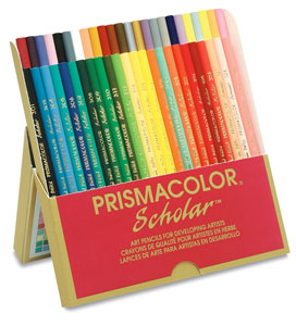
I use Prismalcolor colored pencils.
Prismacolor Scholar Art Pencils


Would you like to learn how to draw? Check out the best book I know of below.


Sunday, December 14, 2008

Mayne Island Arbutus-Original Watercolor Painting

26" x 18"
Watercolor on Arches 140 LB Cold Press Watercolor Paper
$449
Contact the Artist

I started this painting in 1984 after a weekend camping trip to Gabriola Island and Mayne Island. I was on the trip with friends, in October, and it was pouring rain. Everyone except me got soaking wet overnight the first night, and the group decided to ferry over to Mayne Island and stay in a motel to dry out.

I stopped work on it because at one point I was stuck on how I was going to finish the Arbutus tree. This often happens to me when painting a watercolor, and I set them aside until I get inspiration on how to go forward. I also started a new job, and was too tired out from that every day to paint.

In the summer of 2007 my dear brother prodded me to finish the painting, so I searched the Internet for photos of Arbutus trees because I no longer had my photograph to reference from, and decided to get it finished at all costs.

The other thing I discovered was that I no longer had a desire to finish it off in the manner that I had first envisioned, and decided to leave it as is for the most part after painting in the parts that were white spaces on the painting.

So the minimalist style was not planned in any way, I found I just liked it as is.

If you would like to purchase the painting please contact me at tkrysak@gmail.com
Buy a Print

Saturday, December 13, 2008

Andrew Wyeth-An American Icon


I first discovered Andrew Wyeth at age 15 in my first year of High school, and his work has enthralled me ever since. He was one of the individuals that inspired me to become an artist, and to explore the medium of Watercolor. This is the first of my posts of My Favorite Artists.

Andrew Wyeth was born July 12, 1917 and is an American realist painter, and without doubt the best known American artist. Although he has won numerous awards and critical acclaim amongst critics, some have labelled his work more Illustration than Artistic. I can't agree with that opinion, as many famous artists were Illustrators or Commercial artists while advancing their artistic careers. As far as I am concerned, illustration is still art. Andrews father N.C. Wyeth was an Illustrator and artist, and how could anyone not be influenced by that?

Much of his work features the landscape around his home town of Chadds Ford, Pennsylvania, and the people that live in the area.

I just love the organic Burnt Umber feeling of his work, and every time I view it, I find myself lingering and exploring every detail in absolute wonder of how he did it.

He often uses a "dry brush" technique in his paintings. Most of the pigment is squeezed out of the brush, and then he caresses the paper with the lightest touch, building up successive layers of paint over time. I must admit I have failed miserably trying this technique, and have had no success with it.

Wyeth also uses the Egg Tempera medium for many of his paintings. Pigment is mixed with egg yolk and distilled water, and artists throughout the centuries used this medium with great success. One of Wyeth's most famous egg tempera paintings is Christina's World, done in 1948.

Book Image-Courtesy Amazon.com

Here are some links to view some of Andrew Wyeth's artwork.
Museum Syndicate
Official Andrew Wyeth Website

Books about Andrew Wyeth Book


Spring Daffodil-Original Watercolor Painting

9" x 6"
Original Watercolor Painting

I was in a panic to get this painting completed as a gift to my cousin Jordan for his wedding.

I came across a technique in a watercolor magazine that I was itching to try out. The method is to do a monochromatic under painting first, using a mixture of purples with Alizarin Crimson or Cadmium Red, and Ultramarine Blue for cool shadows, and Cobalt Blue for warm shadows.

You can view the original Watercolor Tutorial online by Liz Fluehr here.


Subscribe For Updates

Related Posts with Thumbnails